BRAND IDENTITY DESIGN
COUNTRY FLOURISH
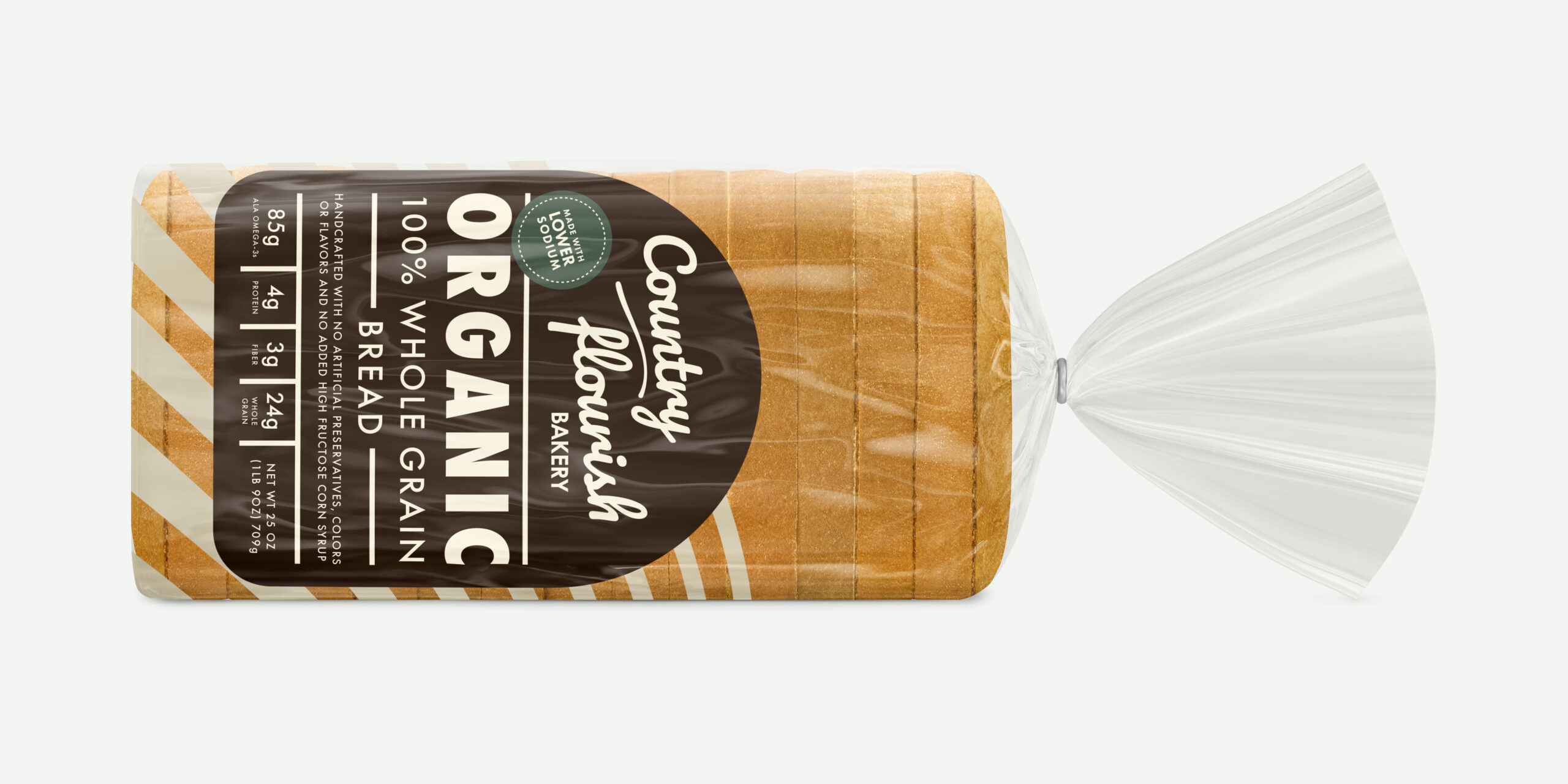
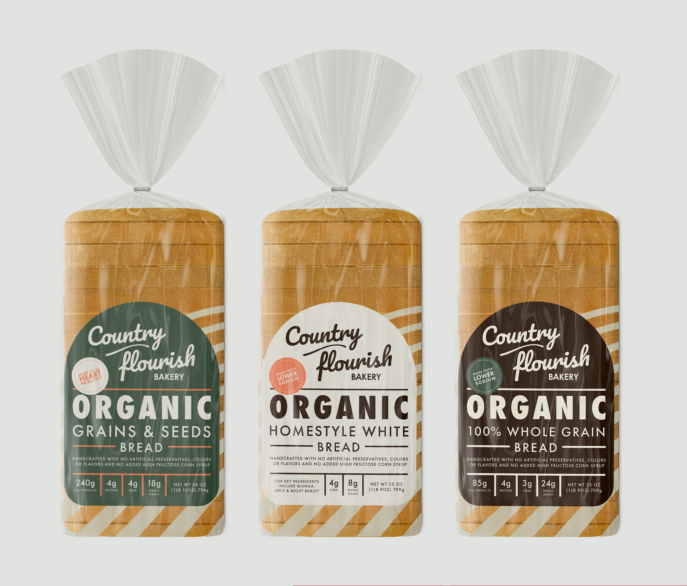
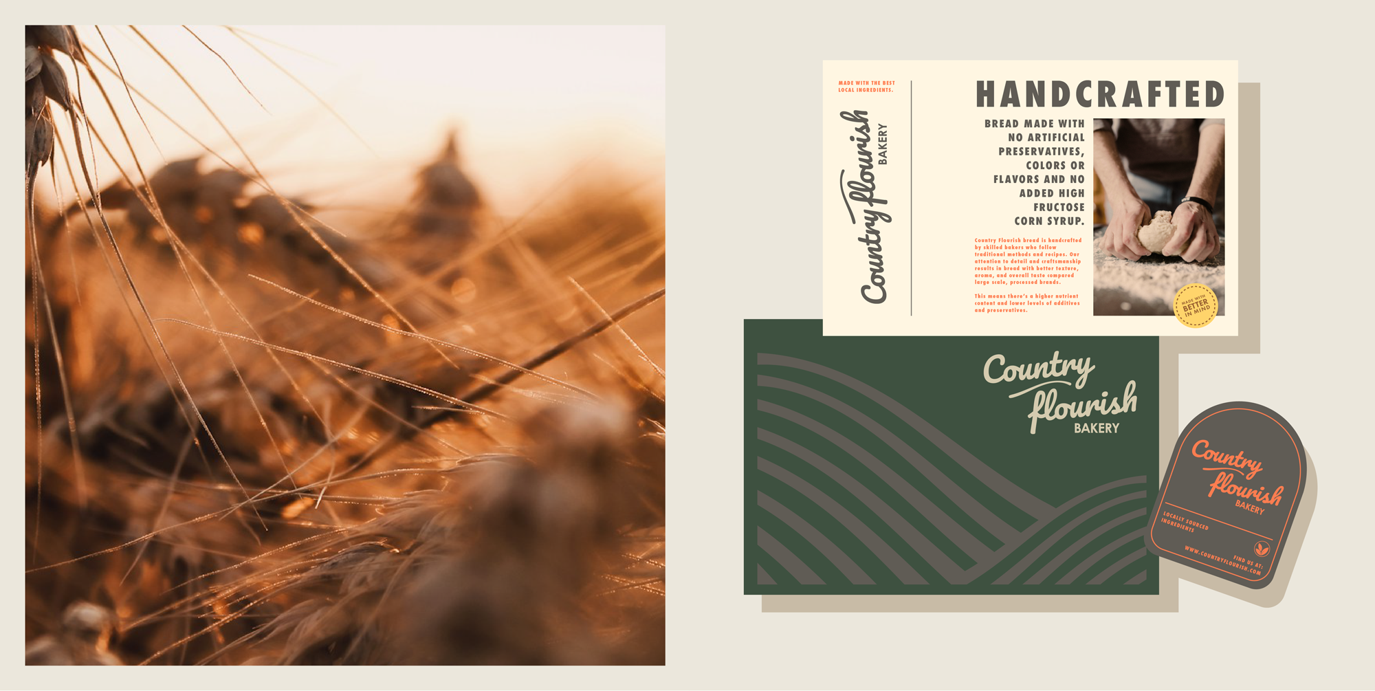
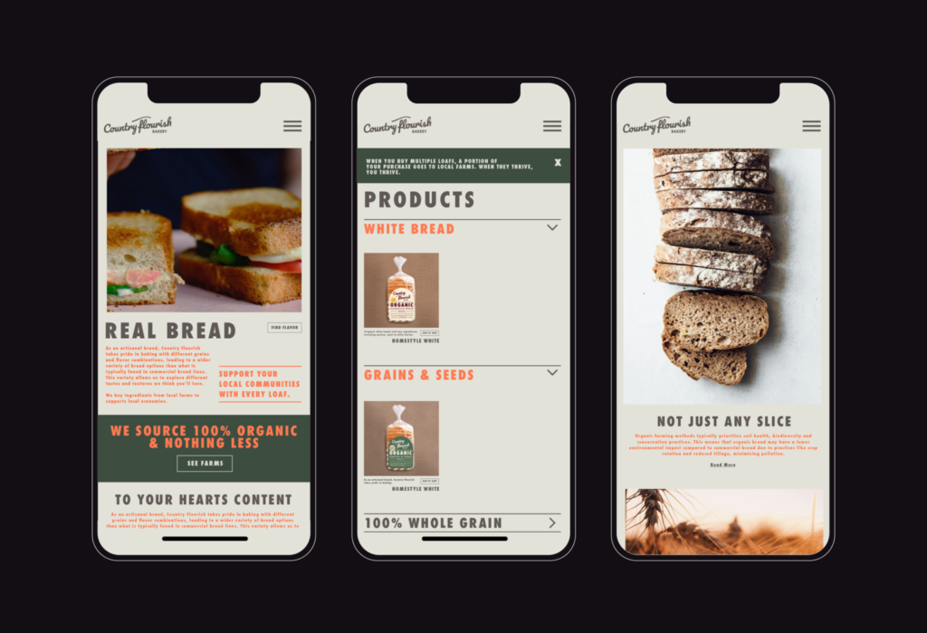
Country Flourish is an artisanal bread bakery that takes pride in producing organic products that rival the commercial stuff. The brand positions itself as the bread alternative with superior taste, texture, and nutritional content compared to conventional bread and other competitors in the healthy segment of the market.
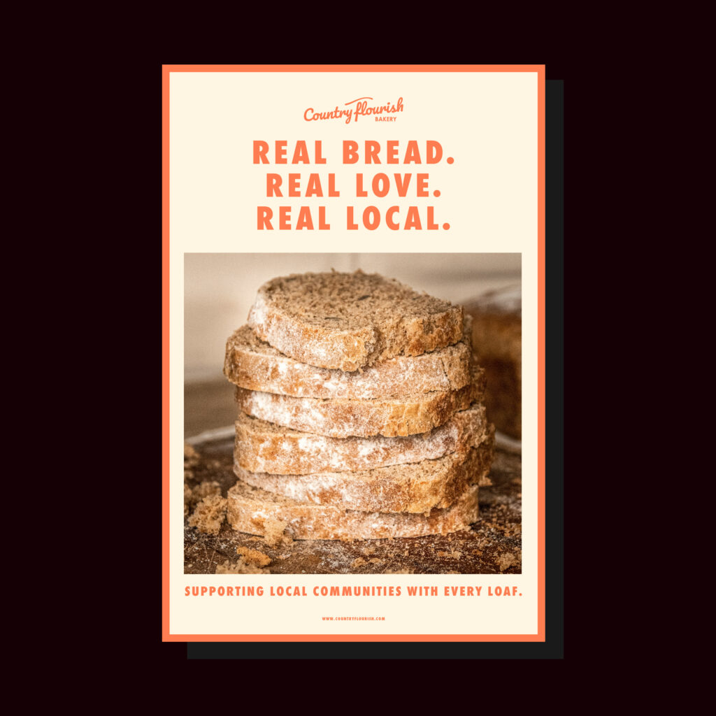
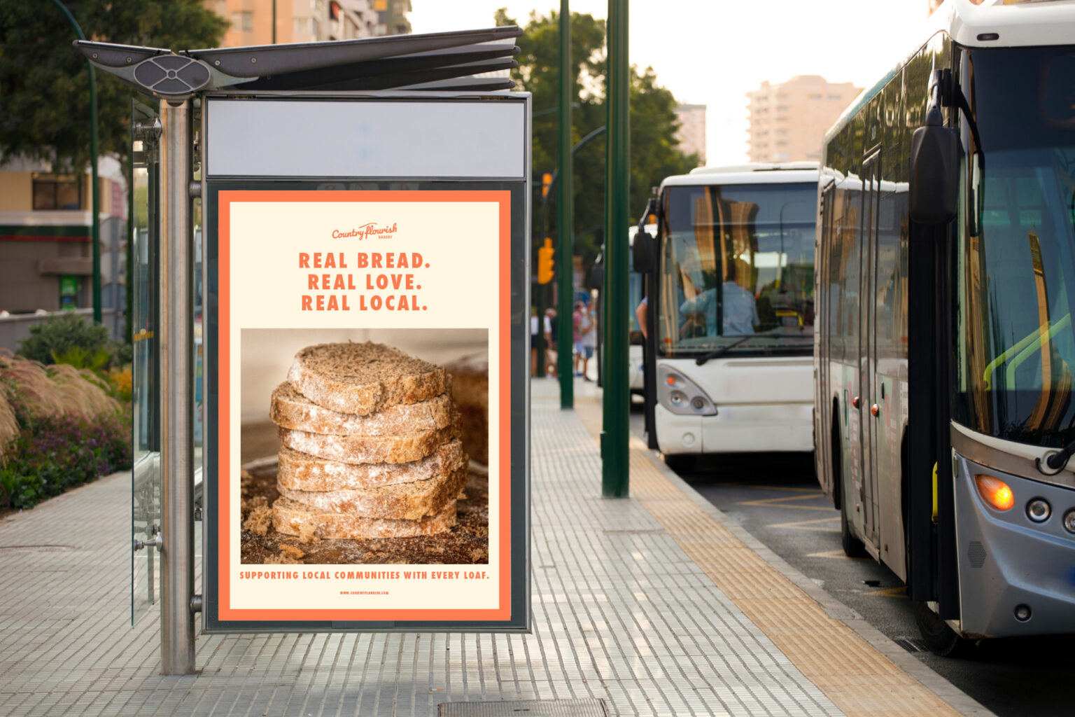
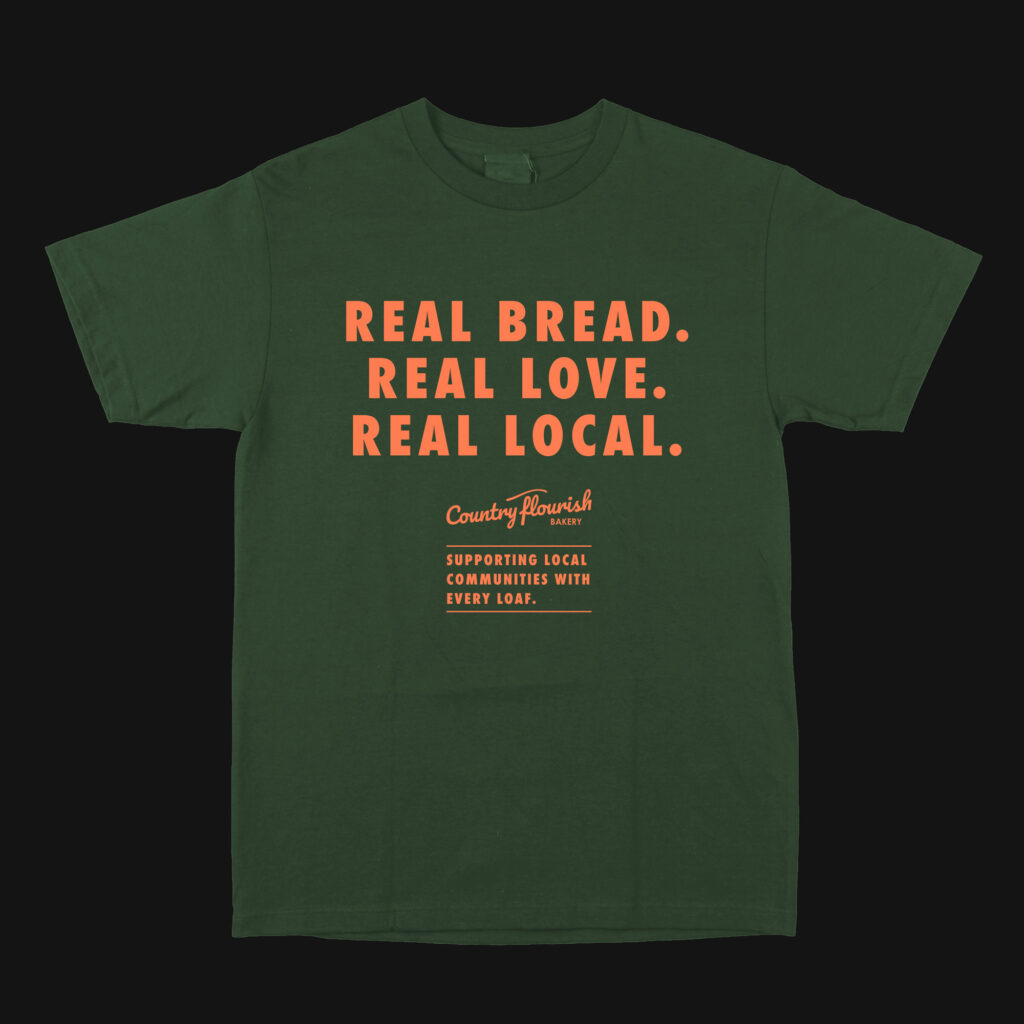
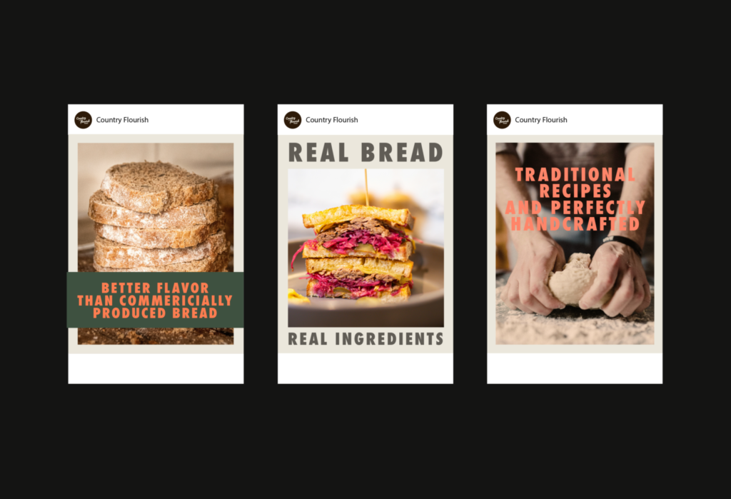
Obviously, the choice to pay a premium for better quality is something consumers would be reluctant to toss out their favorite breads for, so the messaging and the brand story is a little bit playful, yet informative. This way, there’s enough personality that the brand could still come across like an expert without being overly serious.
When designing for a brand voice like this, it was imperative to incorporate vivid and playful colors with more natural, earthy ones. Not only does this create a rustic aesthetic, it creates a great framework to match an artisanal style that millennial consumers find appealing.
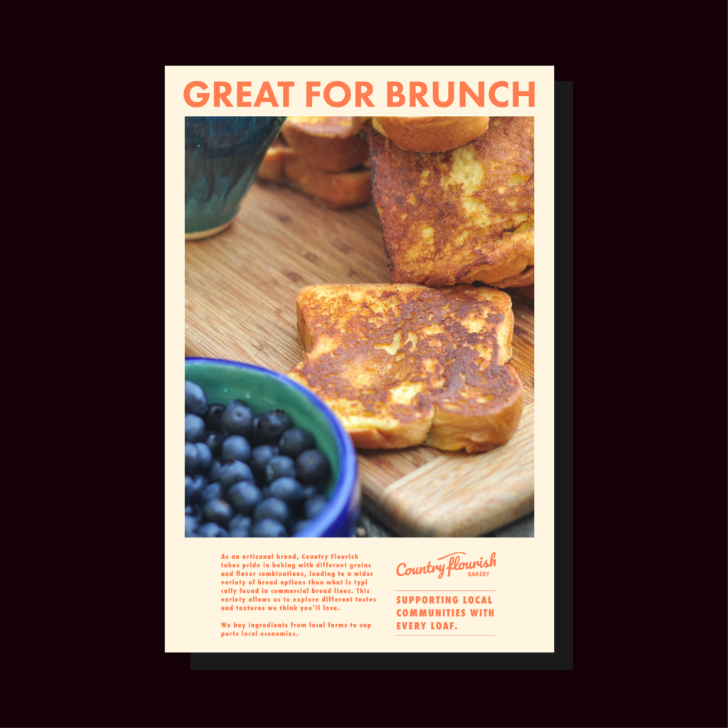
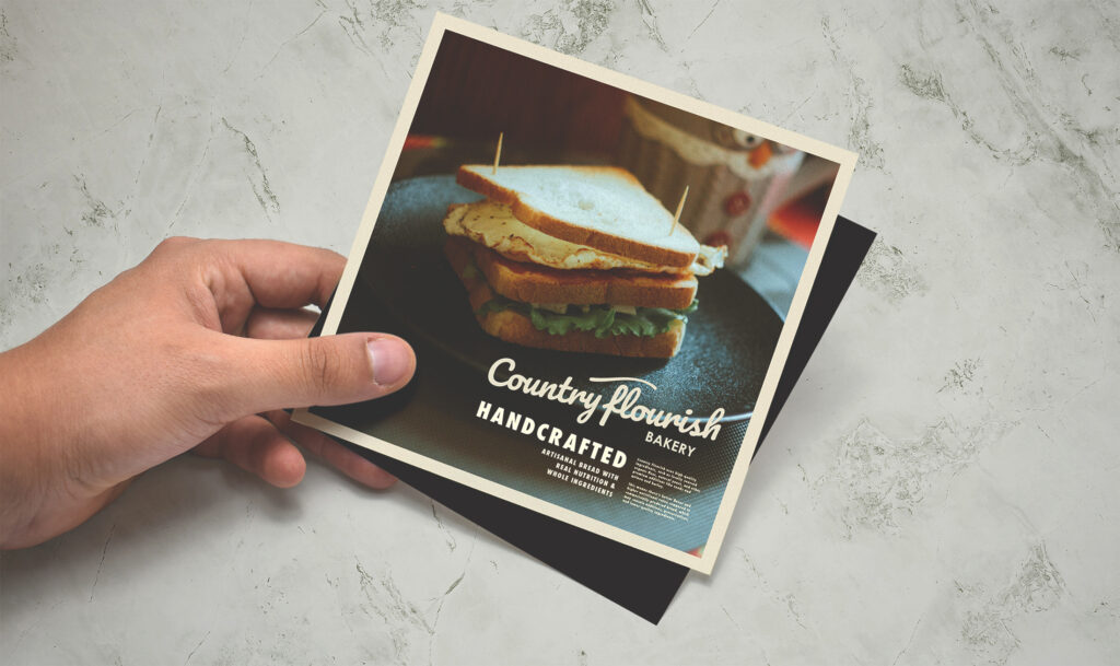
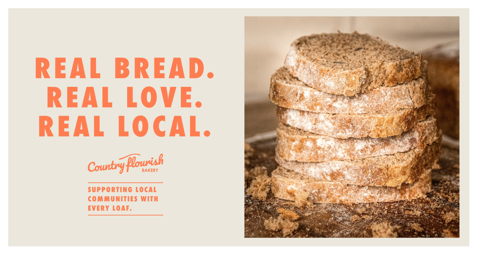
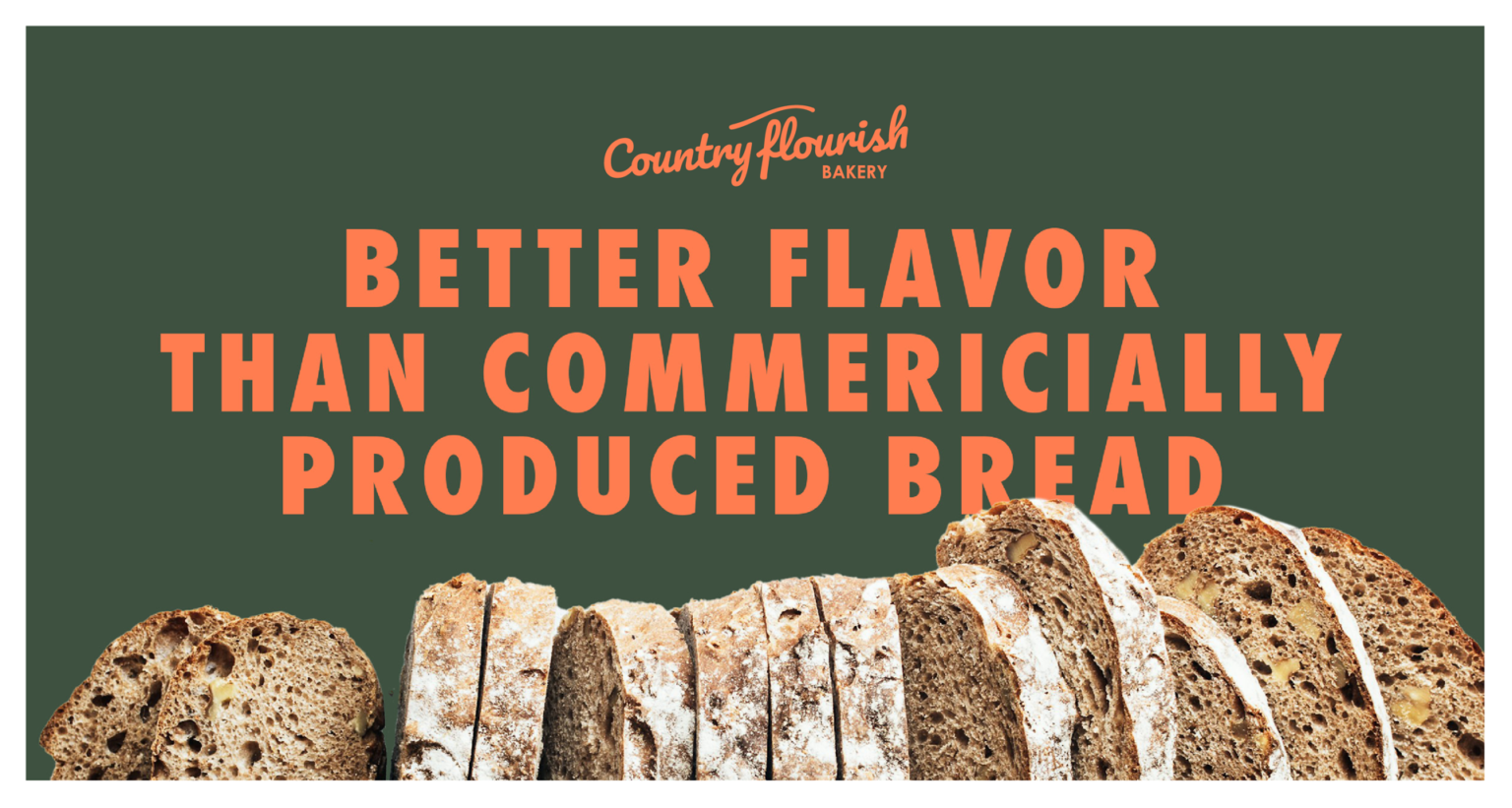
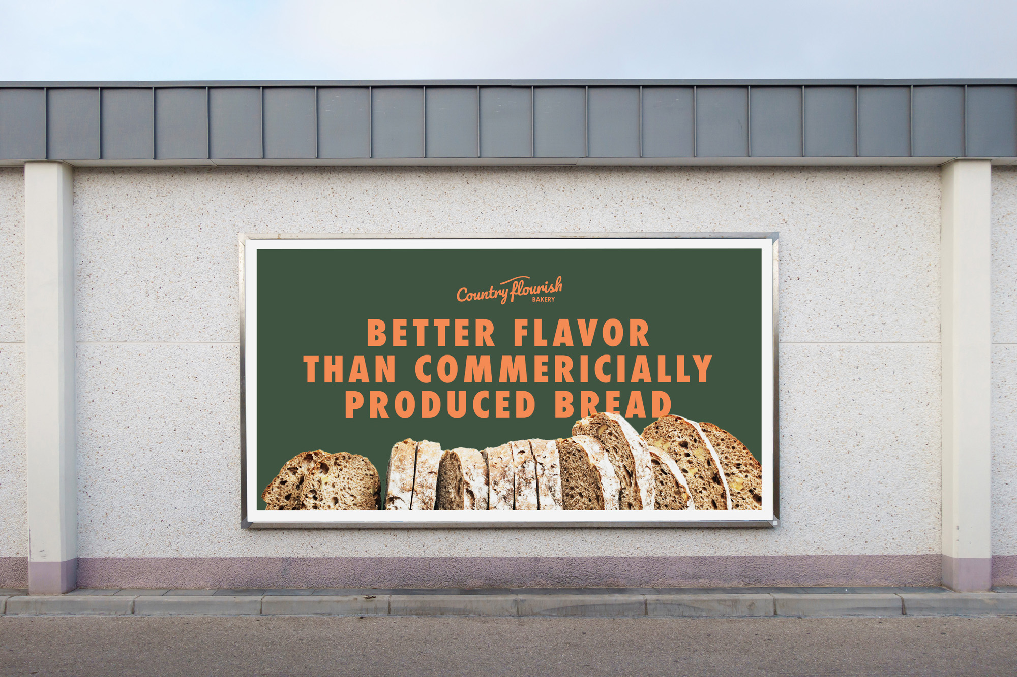
The overall branding, uses macro photography to incorporate texture against large, solid blocks of color. And then, uses really bold and clean san serif type for a modern feel.
Logo & Color
MESSAGING
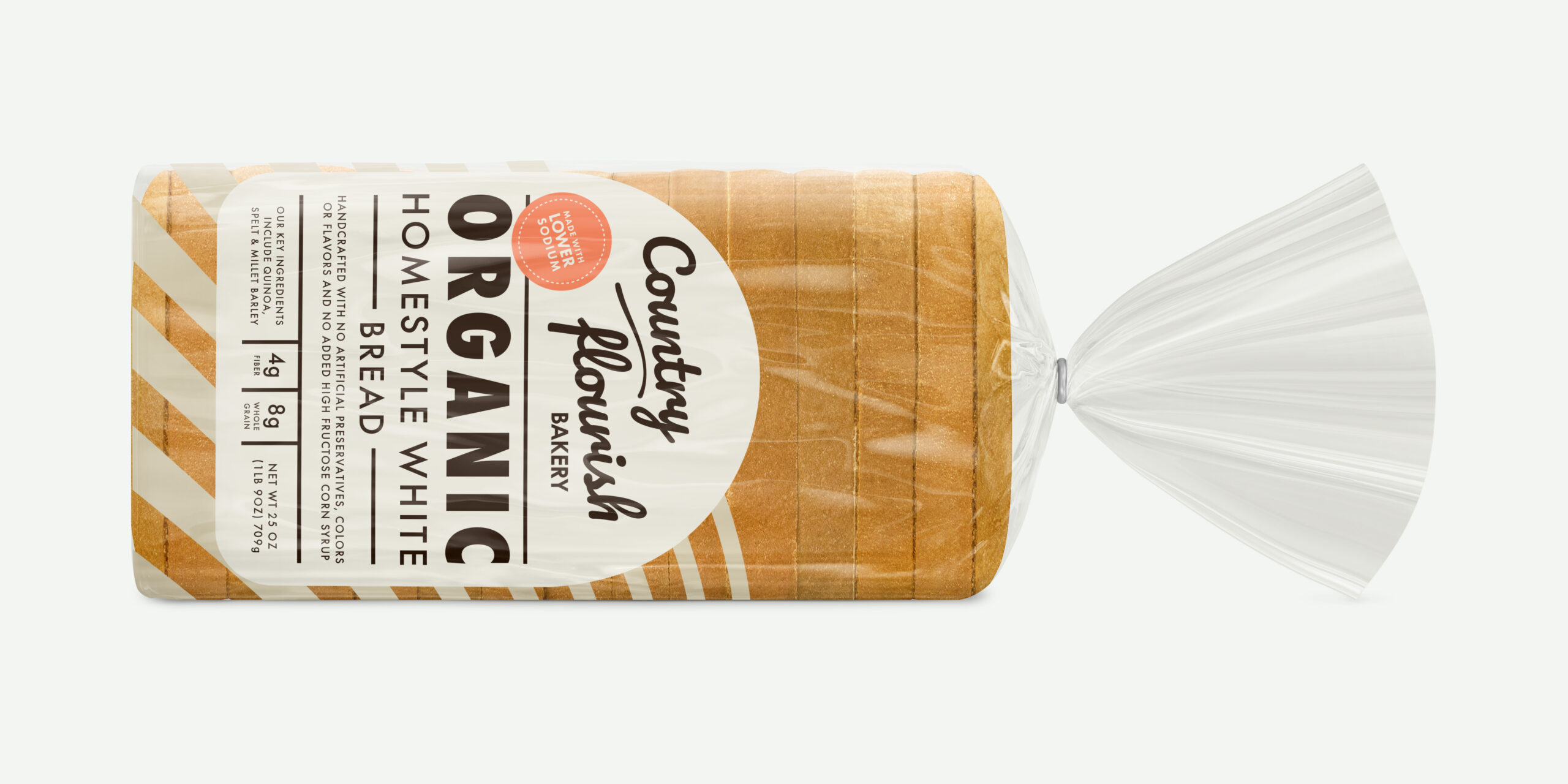
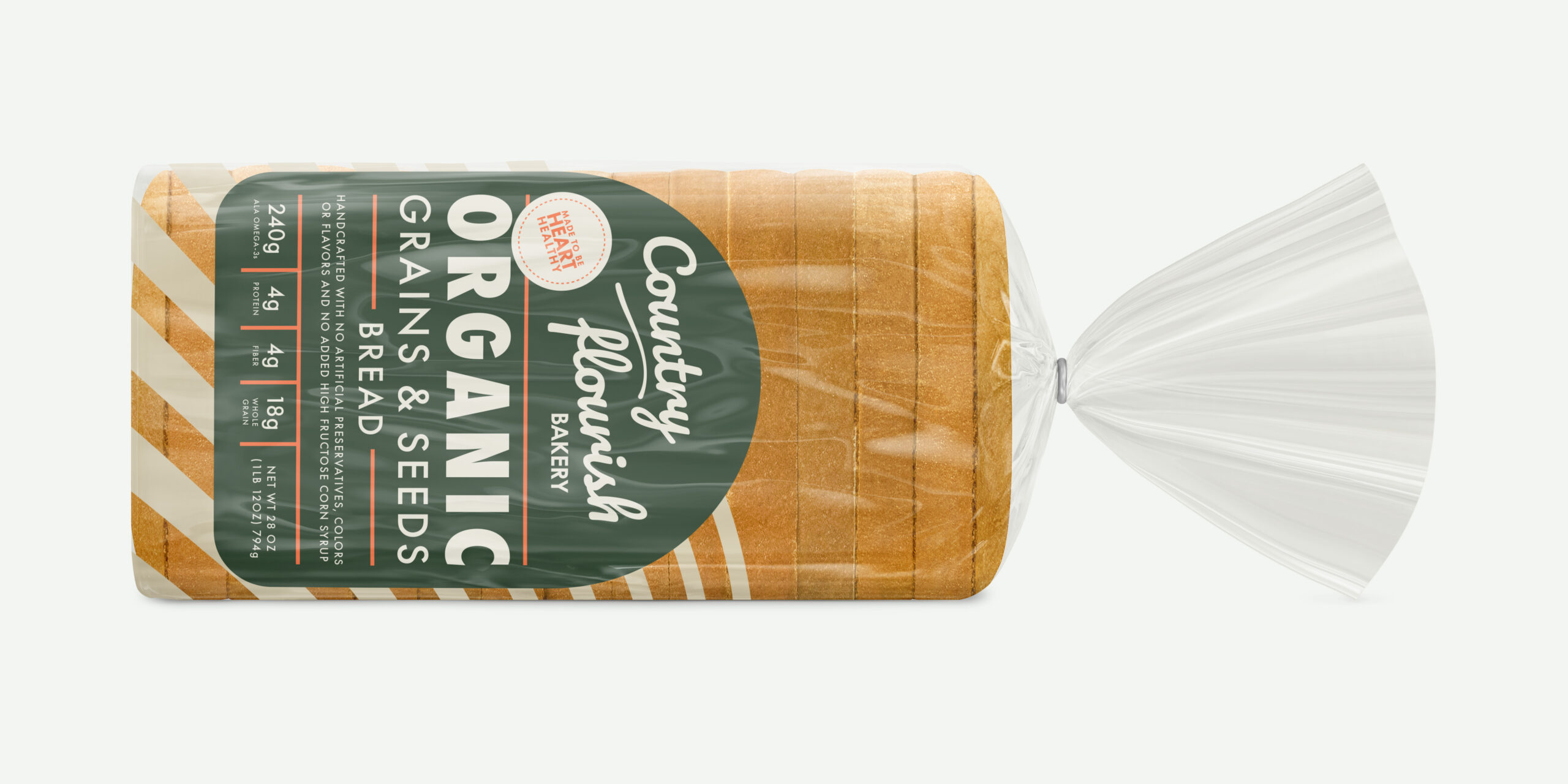
PACKAGING
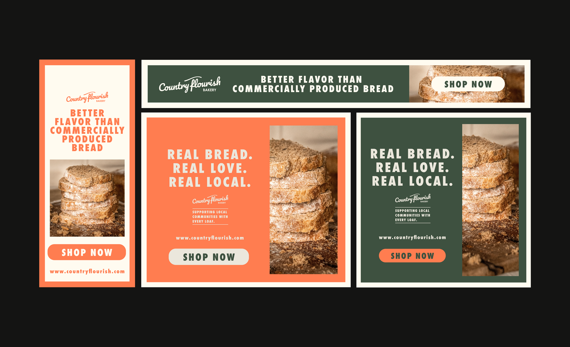
DIGITAL ADS
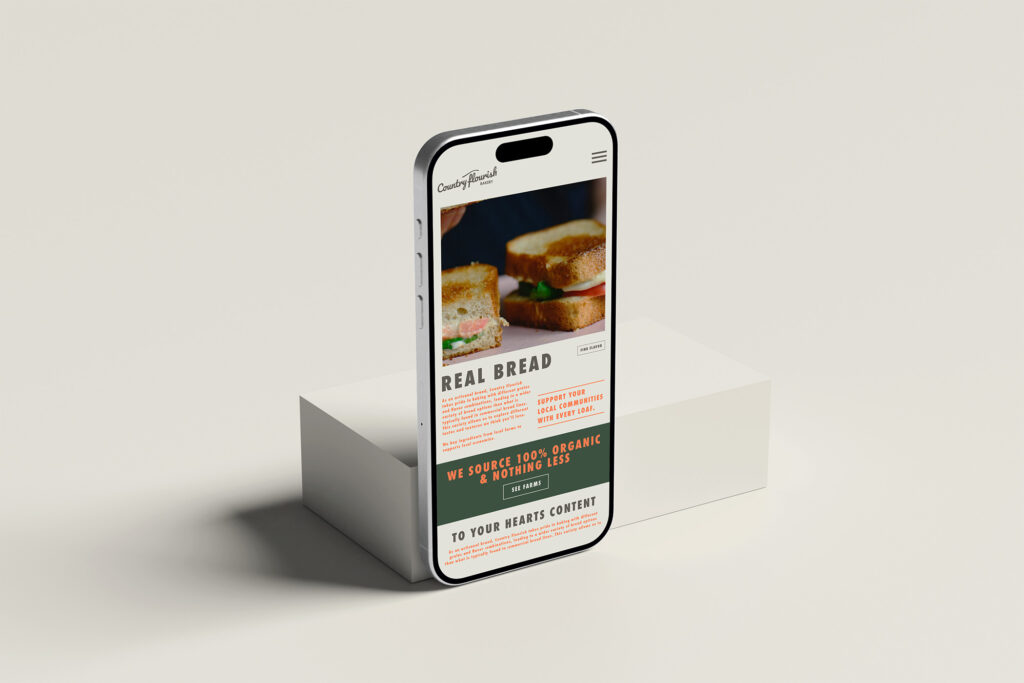
WEB & SOCIAL

